

We're always told not to judge books by their covers but, really, it's hard to help it. There's a lot of aspects that make a cover good or not and everyone sees them a little differently. So, in these posts I'm doing what we all do when we pick up a book - judging their covers.

Colors: I love this! It's so colorful (though it does kinda remind me of Christmas with the green and red) but they all blend nicely and fit together really well!
Font: I'm a fan of swirly font but not on covers so I'm glad this isn't too swirly. It's just enough to make it look whimsical which works well with the story.
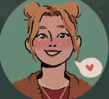
Images: Love. The girl looks just how I picture Alyssa looking in this story. She has just a hint of mischief and madness in her eyes and expression to make it perfect.
Cover Relevance: The bugs, the cover model, and chaotic greenery. All very relevant. It totally just shouts Wonderland.
Rating: Totally on point.

Colors: Very Red. I can handle it though, especially because it's lighter and darker in areas. It really gives off a sense of impending doom, ya know?
Font: The font is pretty simple and very easy to read and I like that it is spruced up a bit with the swirling design around it. And I like that the red shows through the black design to spell out the title.
Images: I'm not a huge fan of just having the girl sitting in a field of flowers with a white dress on. But I like the silhouette of the castle in the background.
Cover Relevance: It's relevant. I mean, it has the castle and the main character on it but I feel it could have done better.
Rating: It does its job.

Colors: I honestly am not a huge fan of the yellow and green. It looks like a sickly yellow-green to me.
Font: Simple but not boring. It fits the feel of the story!
Images: Cute shirtless boy and a city silhouette. Hey, I'm not complaining.
Cover Relevance: Not totally relevant. It has one of the main characters and the setting. There's a lot of small details that tell you more about the story.
Rating: As a twelve year old, I was afraid to buy this because I thought my parents would think it was a mature romance novel and they would take it away. I still hide the cover from my dad when I'm rereading it.

Colors: So pretty! I luff it.
Font: It feels very regal and decorative but it's easy to read.
Images: Not a fan of the half face trend. At all. It is pretty with the colors framing it though and the girl is really lovely!
Cover Relevance: It's the main character so it's okay. But I feel like it would have been easy to design something more relevant to put on the cover.
Rating: Meh.

Colors: Yes, so pretty. I love how the colors are pale in the middle and gradually get darker and more prominent toward the edges.
Font: It's nice and easy to read.
Images: HOLY YES SO PERFECT
Cover Relevance: So relevant! The knife and the eye reflected in it are amazing and are so significant to this story.
Rating: If I publish a book, I want my cover to be this beautiful.
What do you think of these covers? Love 'em? Hate 'em? Leave your thoughts in the comments below!
PS: Wonderland's Reader recently reached 300 followers! To celebrate, I'm hosting a giveaway in which you can win five awesome books! To enter, go here.


I still want a copy of Splintered and honestly it's all been because of the cover!
ReplyDeleteThe covers in that series are amazing! I can't wait for the third book to release so I have the complete set :)
Delete